Dining Room Reno
Motivation Monday
We’ve been working hard to get each room in our farmhouse renovation checked off of the list. Its been challenging since Mike and I have been doing a lot of the work for the reno ourselves and to-dos in different rooms hit the priority list that inhibit us from completing one actual room. For instance, our music cabinet in our family room is still not built. Truthfully, we thought that would have been the first thing Mike completed! Holidays, events and life have kept our list on its own track, despite Mike and my frustration. The good news is that we are still getting things checked off the list, just maybe not in the order we’d like!
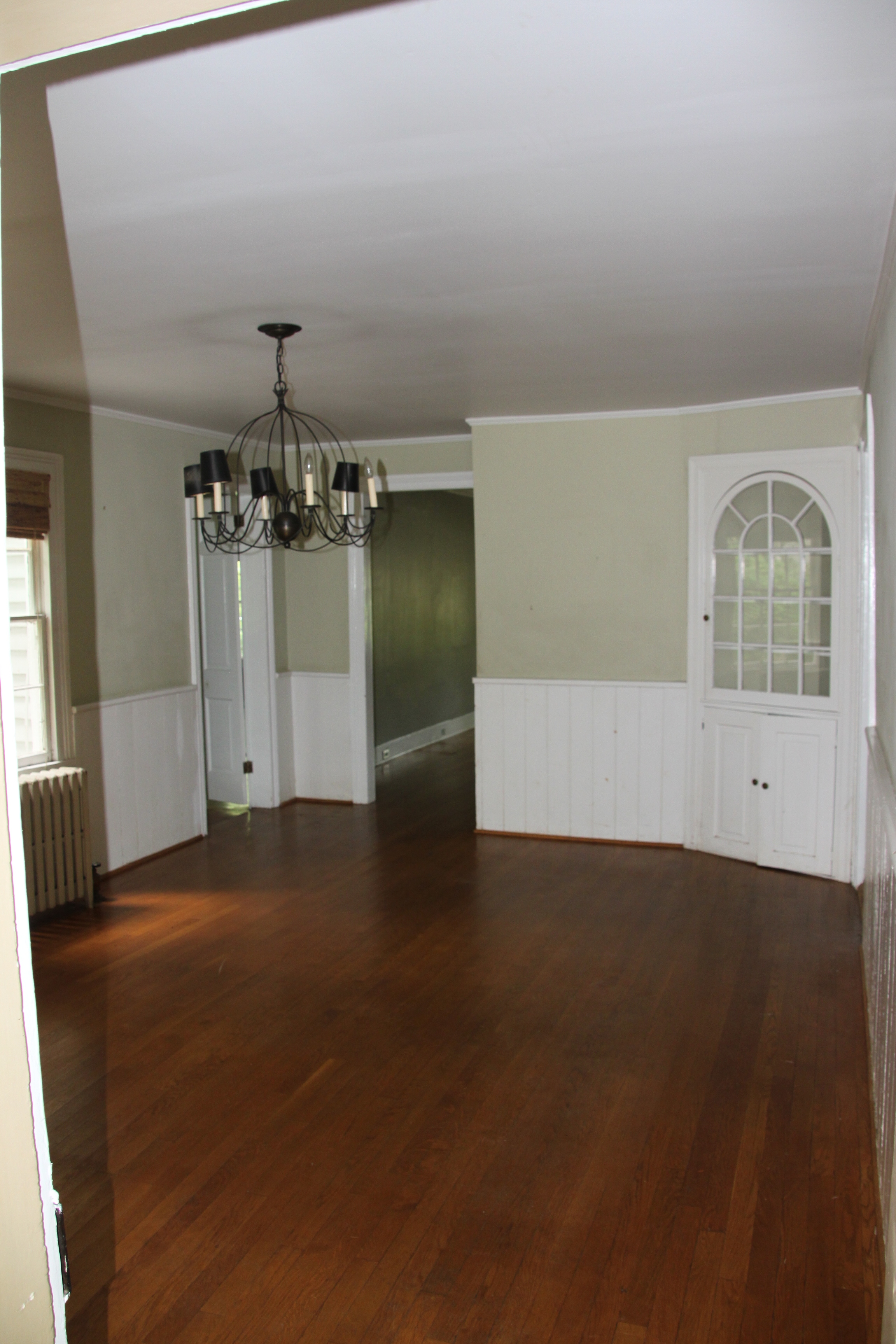
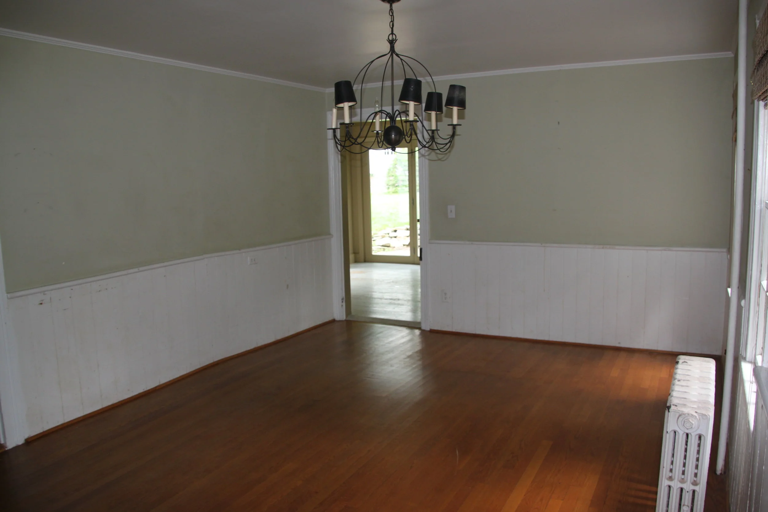
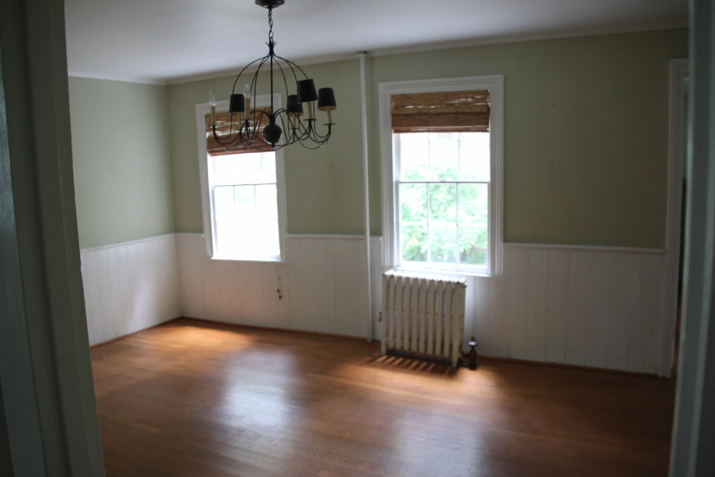
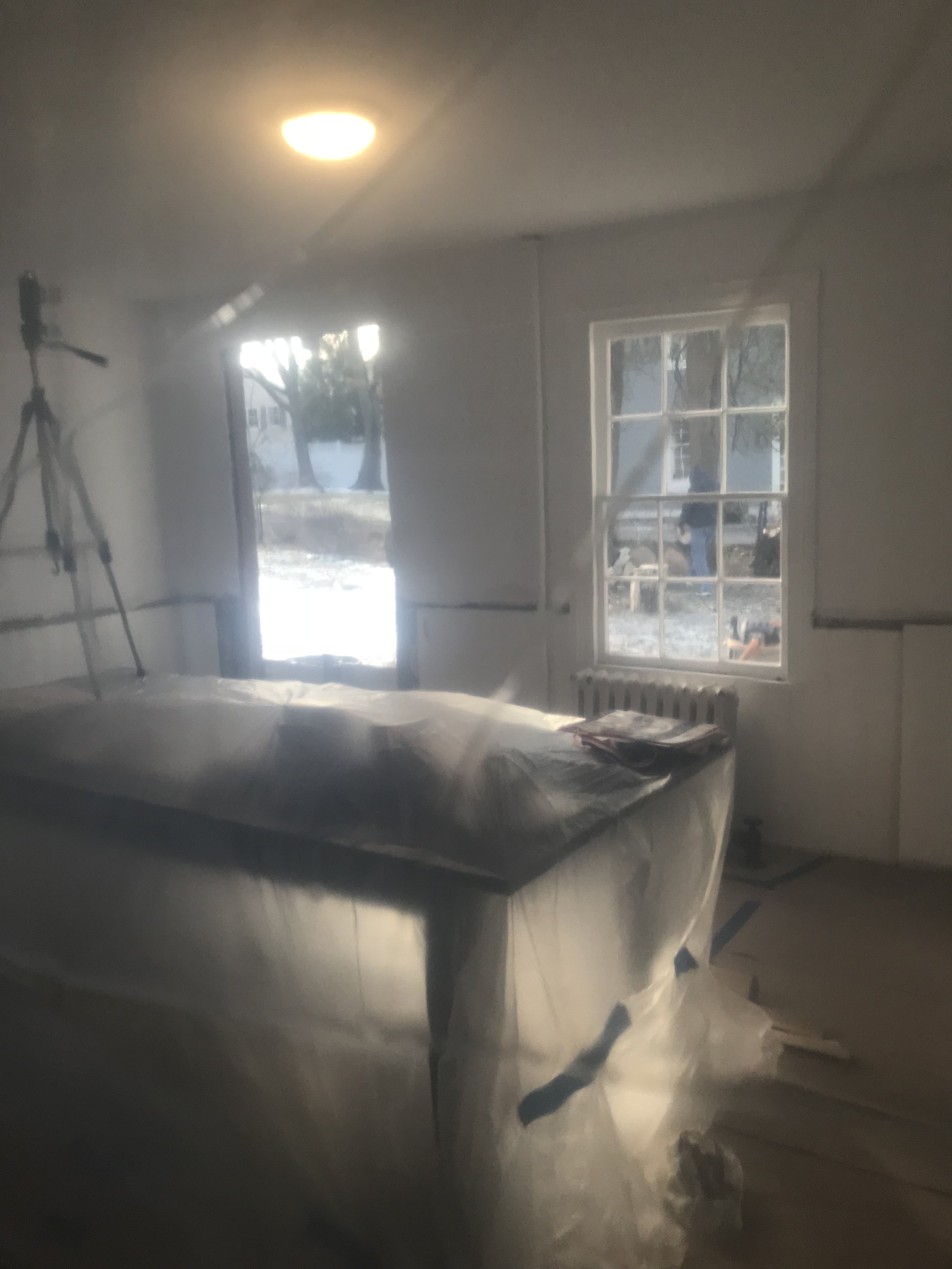
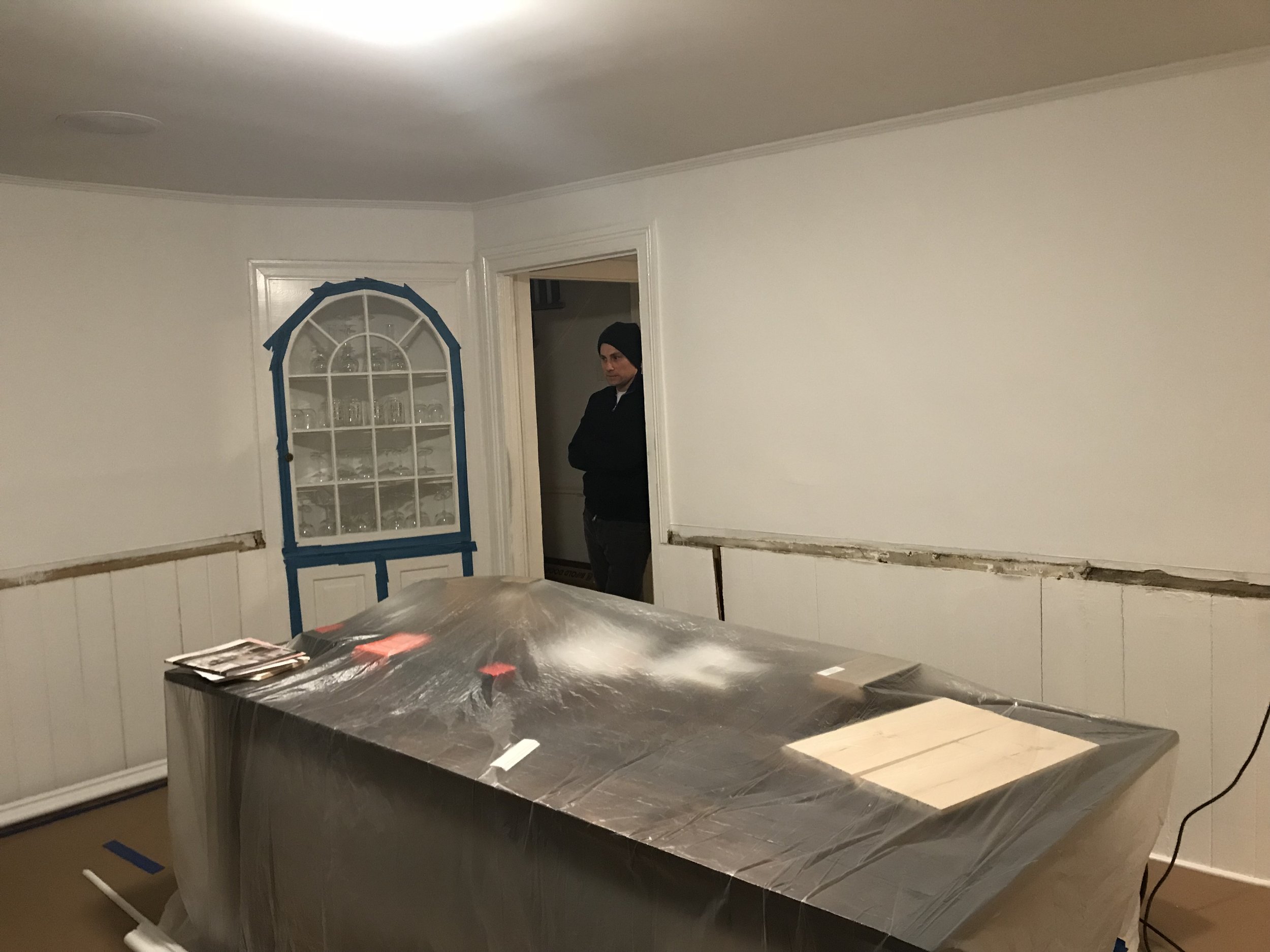
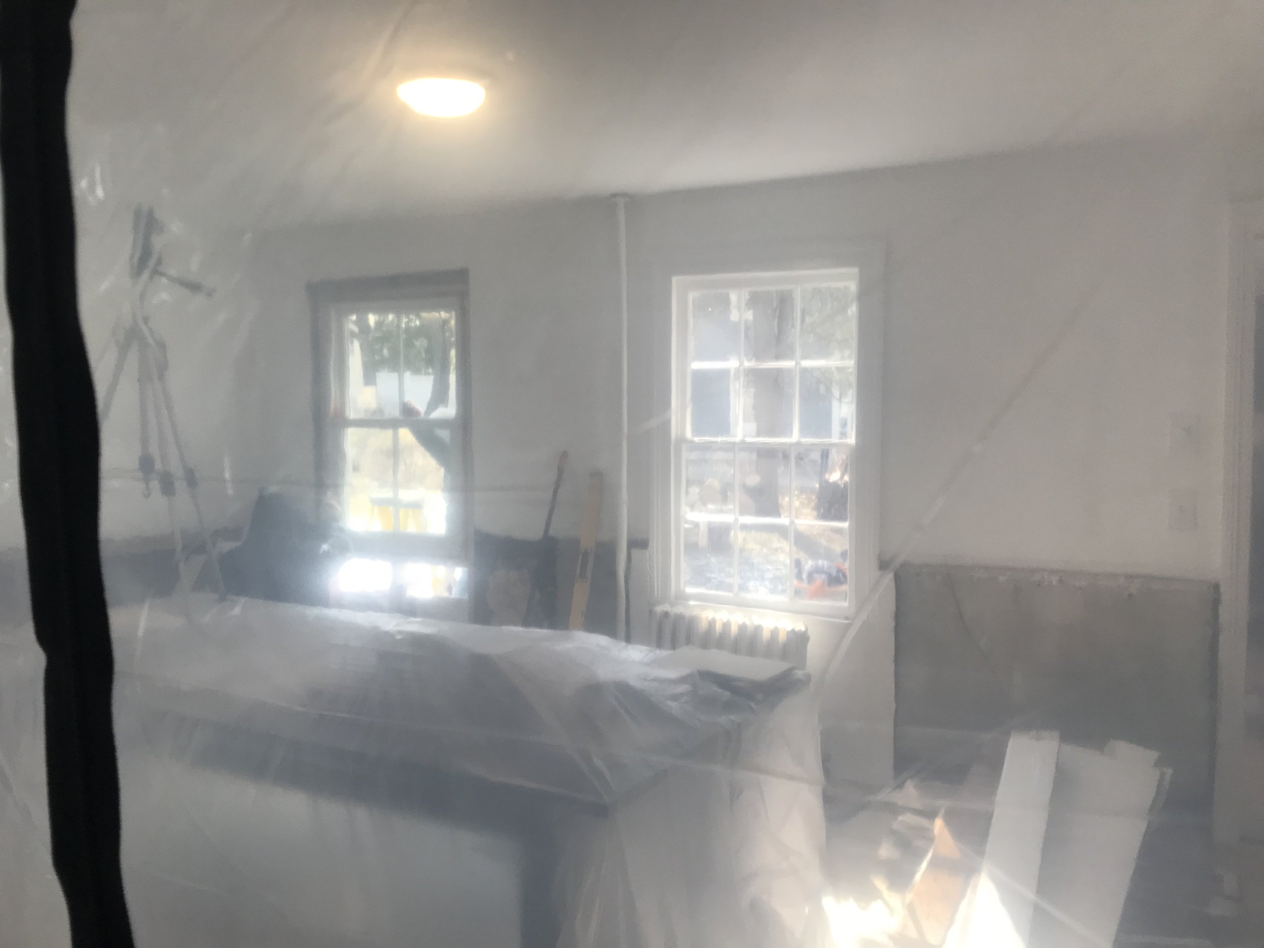
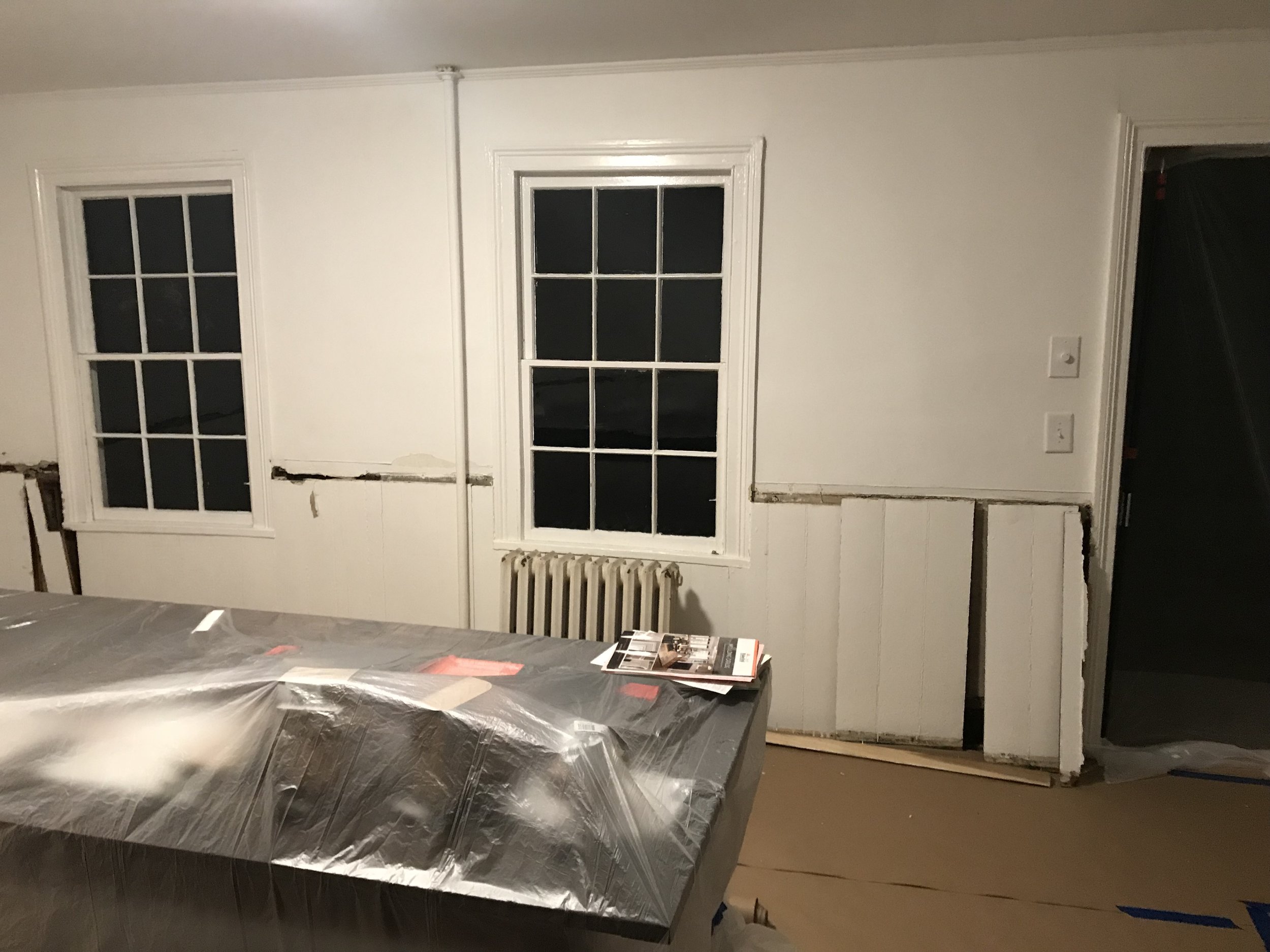
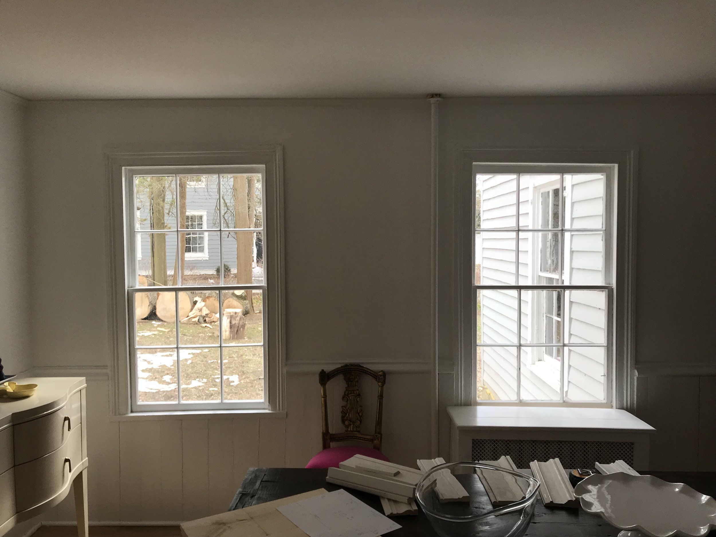
Let me delight you with some before photos of our dining room (😁😱):
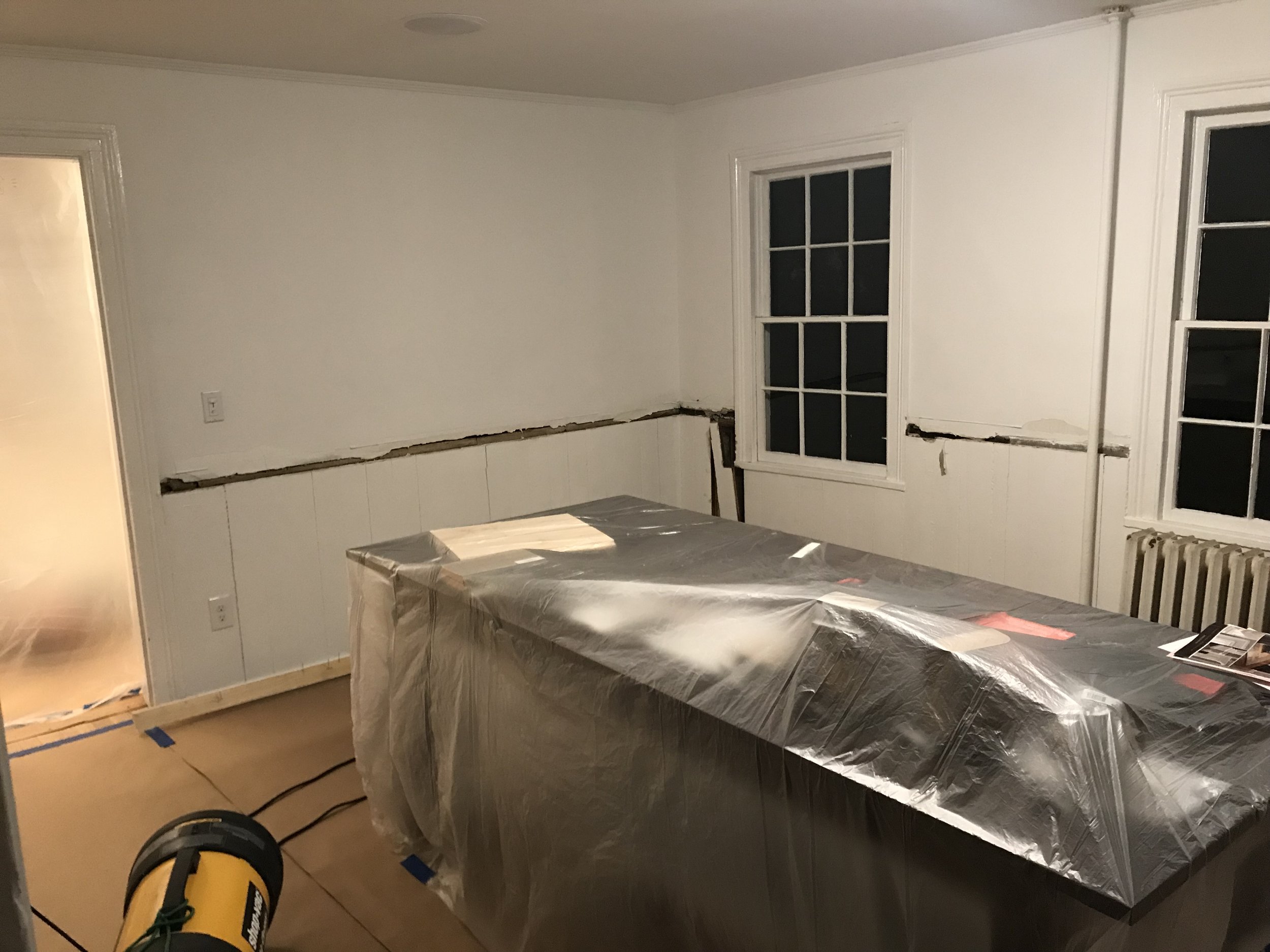
And during the renovation:
We were going to restore the farmhouse vertical paneling that was under the chair rail, but because it was in such bad shape we decided to take a modern twist on the space and added shiplap instead. Thank God because it really cleaned up the space in an awesome, light and airy way!
After the holidays Mike started planning and eventually executing the stereo cabinet in our family room. Literally a few weeks later we were off the races with the Bitsy Pop Up Shop planning, so the cabinet got put on hold yet again. After the Pop Up Shop we started getting the house in order for Lucy’s Communion party (was this past Saturday, April 27th!). That “to-do” list once again derailed us from the stereo cabinet, however, made us focus on getting our dining room complete in order to host 80 people at our home on Saturday! We are very happy with how it turned out and want to share with you all here…
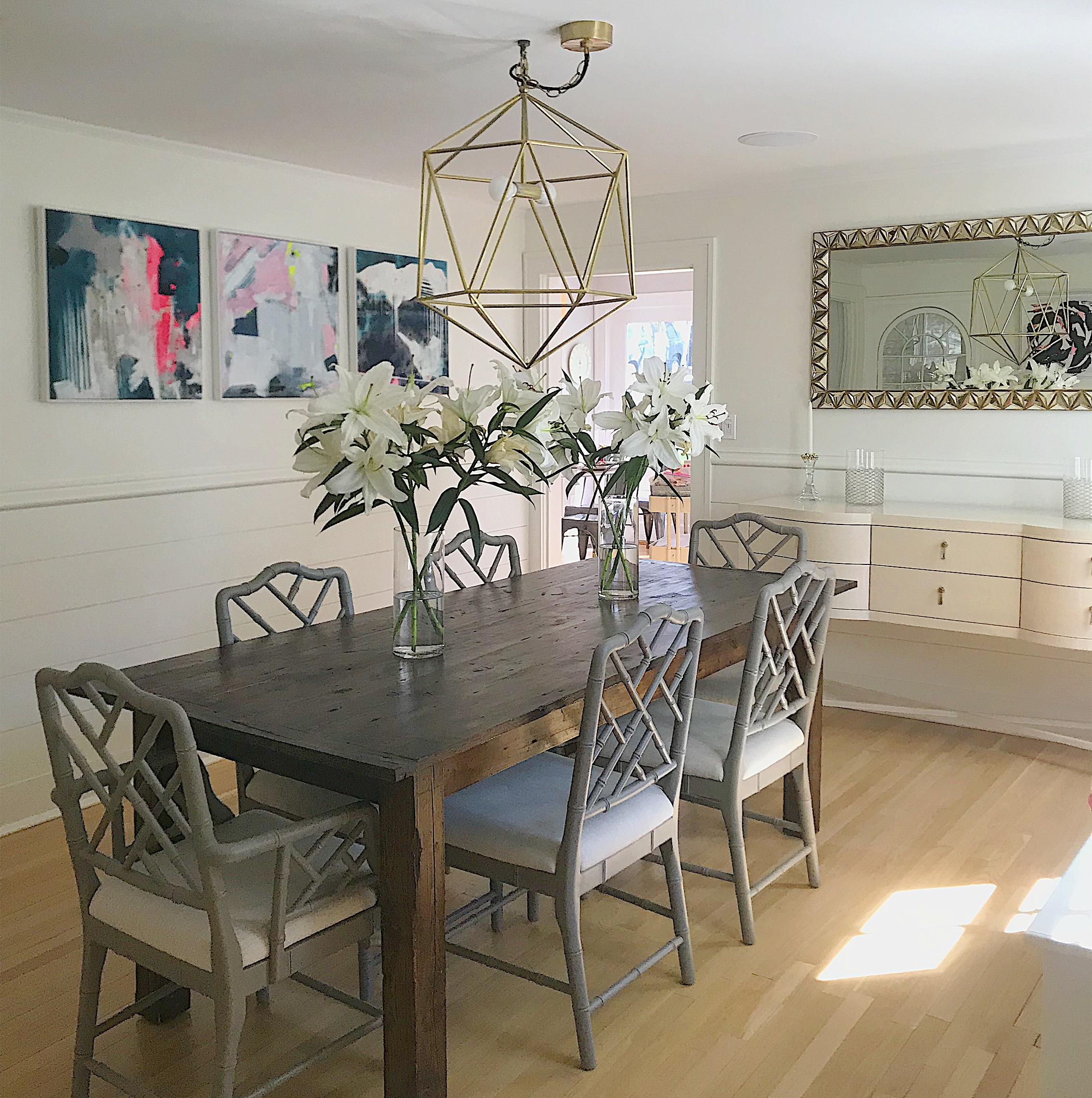
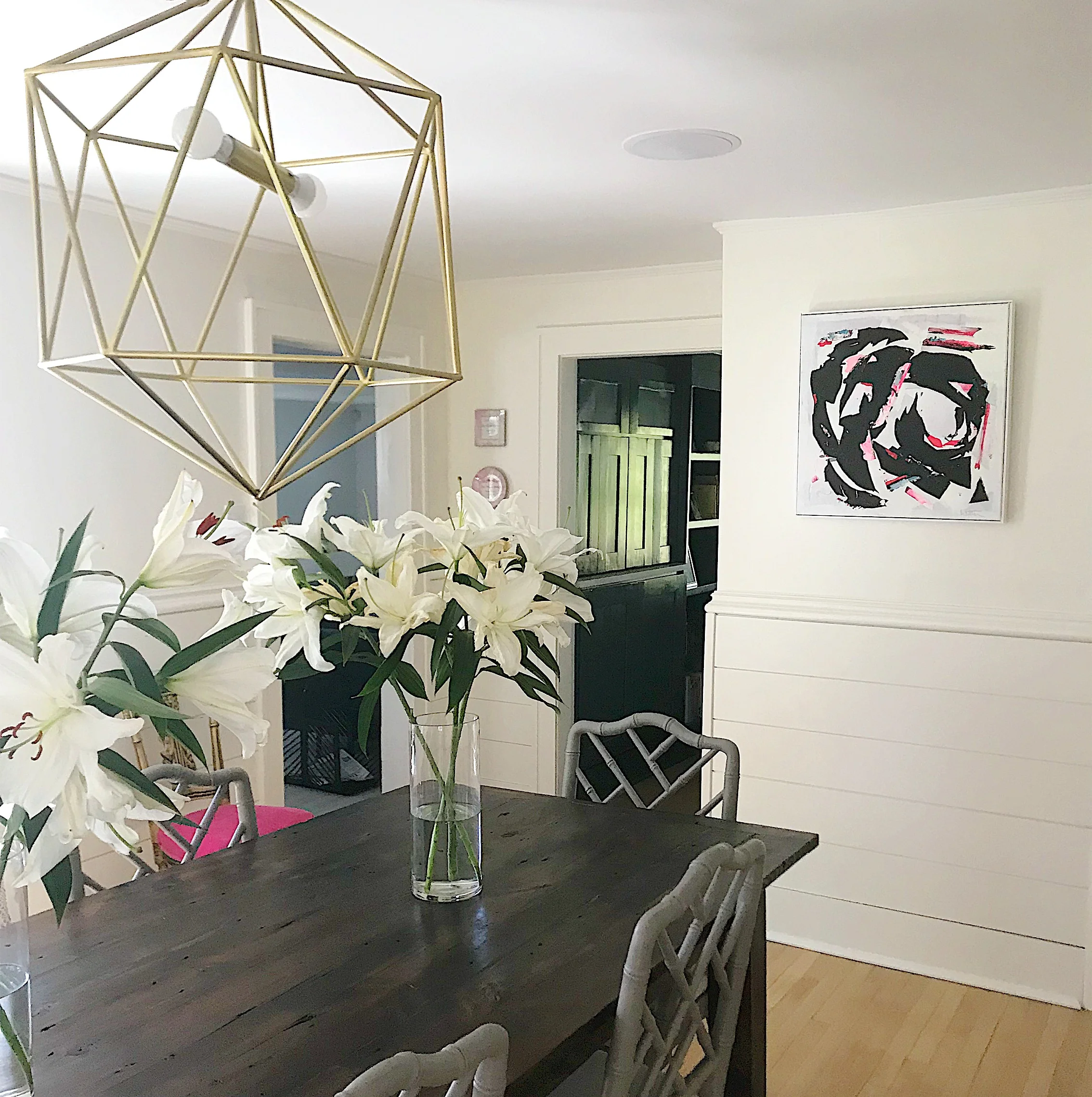
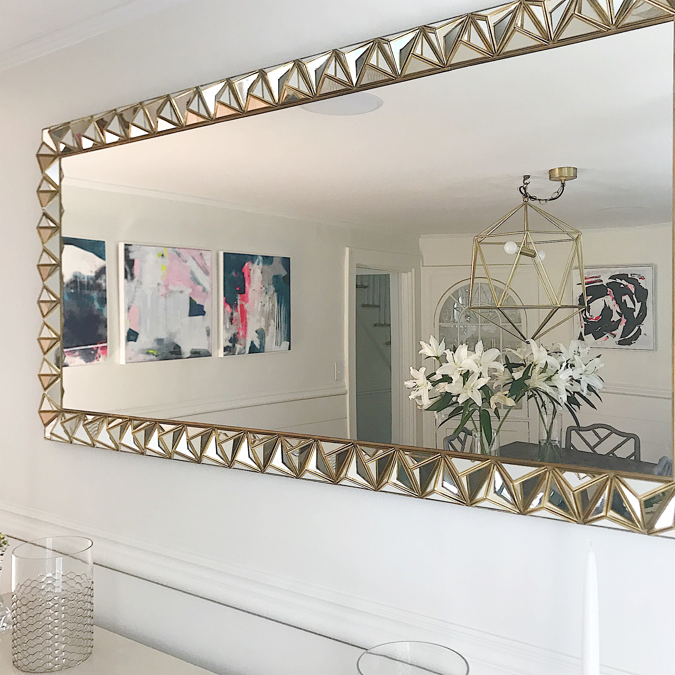
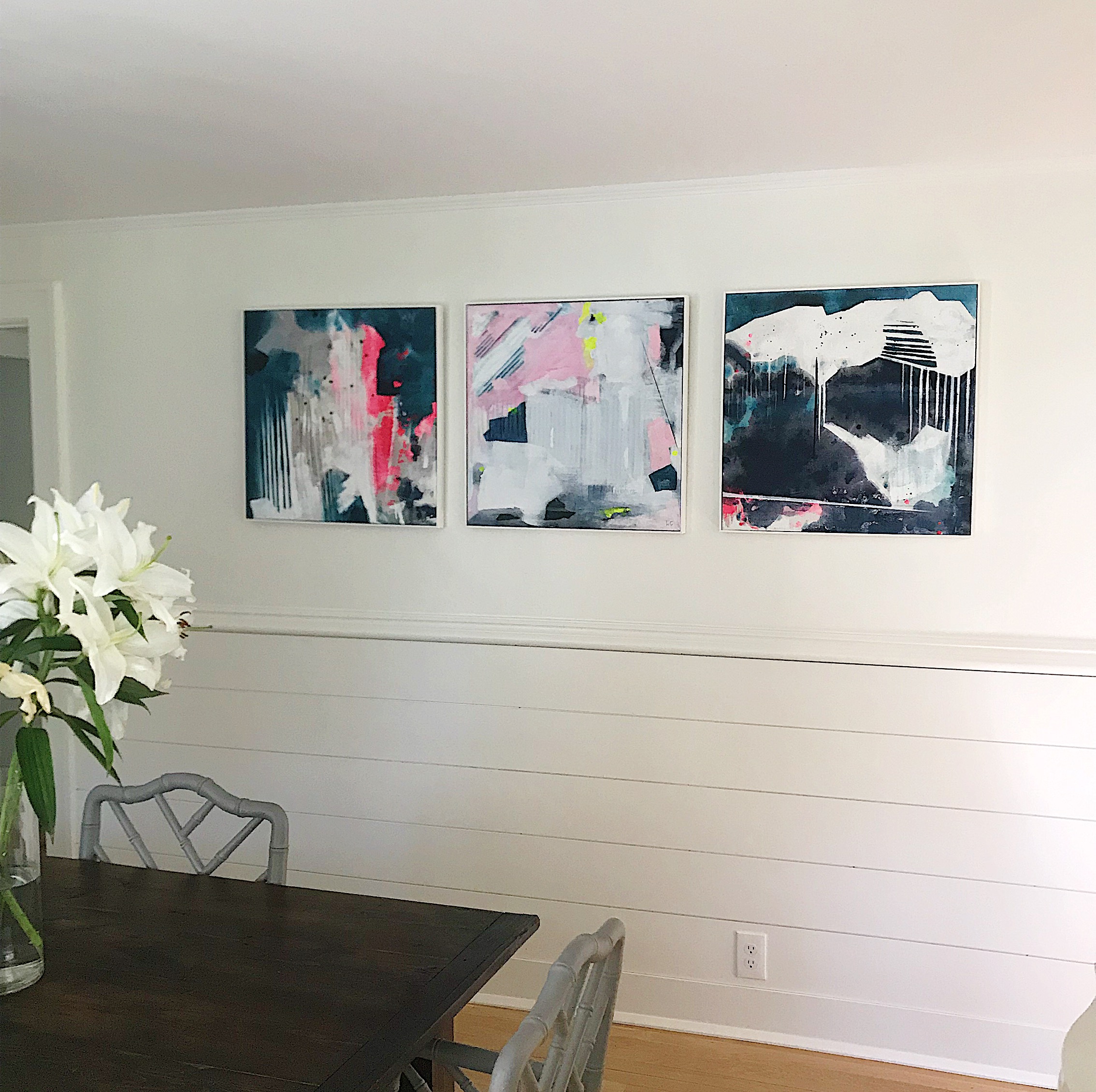
Here are the dining room after photos:
Our dining room table is one Mike and I built right after we got married (almost 11 years ago). We sourced old barn wood in Litchfield, CT and used a jacobean stain for the wood’s finish. Our chairs are from Ballard Designs - we did 4 of the Dayna Side Chairs and 2 of the Dayna Arm Chairs in warm grey. Our chandelier is from Anthropologie (no longer available) as well as our mirror. Our server was a “steal” find at a favorite furniture warehouse in CT. My sister, Courtenay, runs a fabulous interior design business along with her equally as fabulous partner, Whitney - DIGS, LLC. Those two have helped us in more ways than we can mention. Piecing things together, choosing the right sizes, making sure everything flows. Their vision married with ours it was has really made this whole house feel like home to us. If you are local you need to check them out for your next home project - DIGS, LLC.
Our dining room is particularly tricky because it is very much a contrast space. Even though it is our dining room, which is typically supposed to be a little dressier and neater, it is the central part of our home. In order to get from our mudroom | kitchen | family room | living room you have to cut through the dining room. I love this about it, actually, because Mike and I are not super dressy people. It is one of the things I fell in love with the most when we first saw the house - it is gives it a flow (without too much open-ness) and creates a homey feeling from the start. We don’t like the pomp and circumstance that comes along with a dressy dining room set-up and want our home to be comfortable + functional as well as decorated, if that makes any bit of sense!
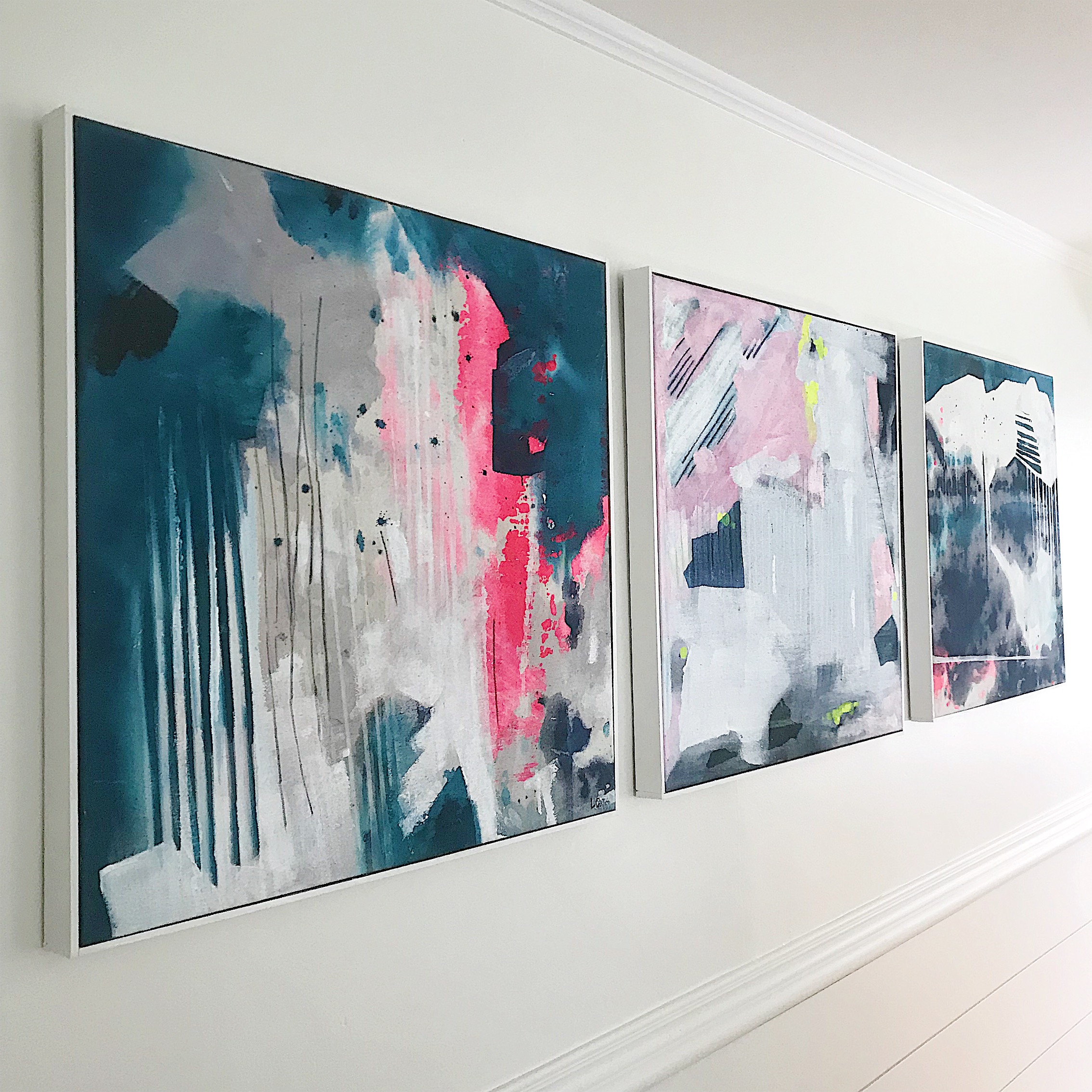
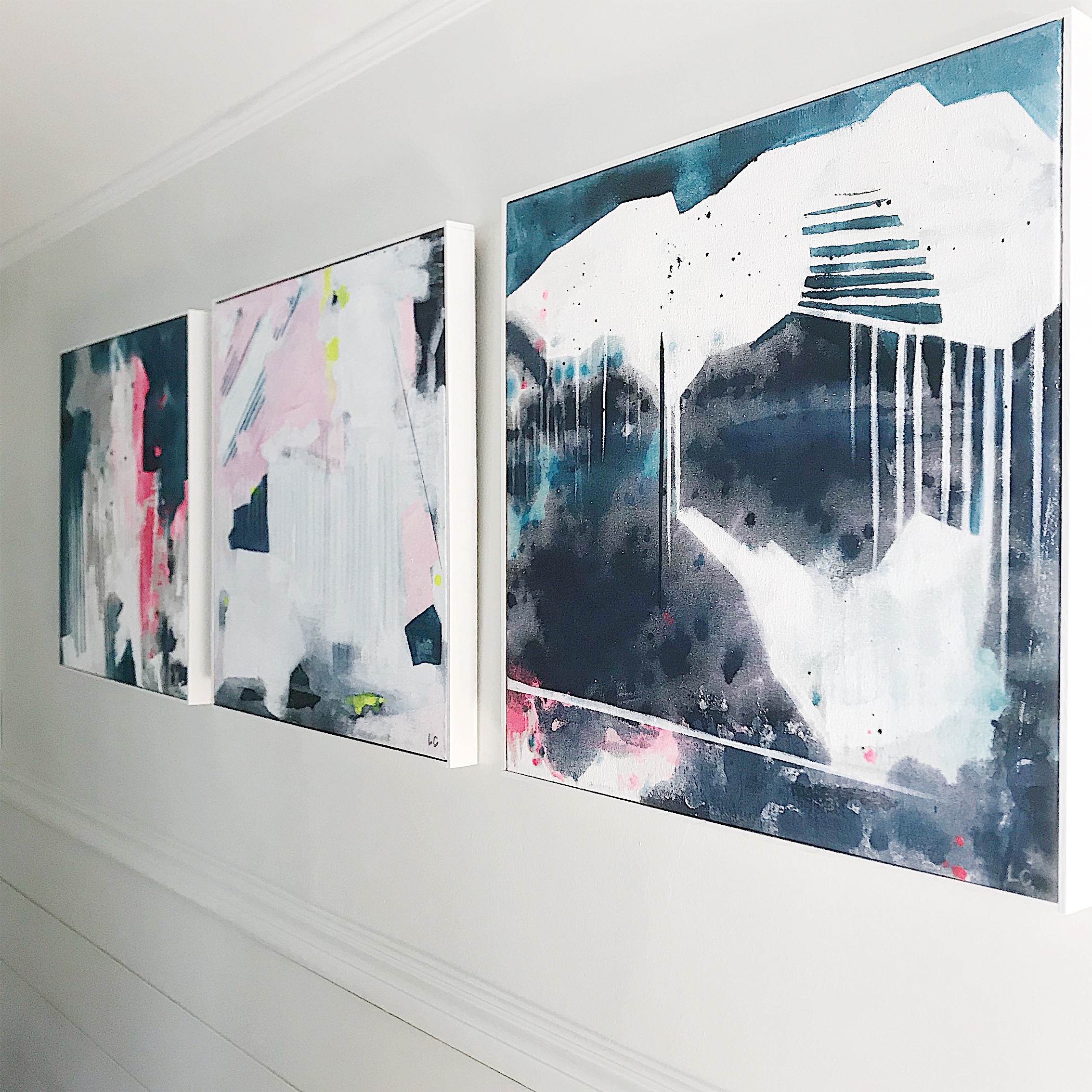
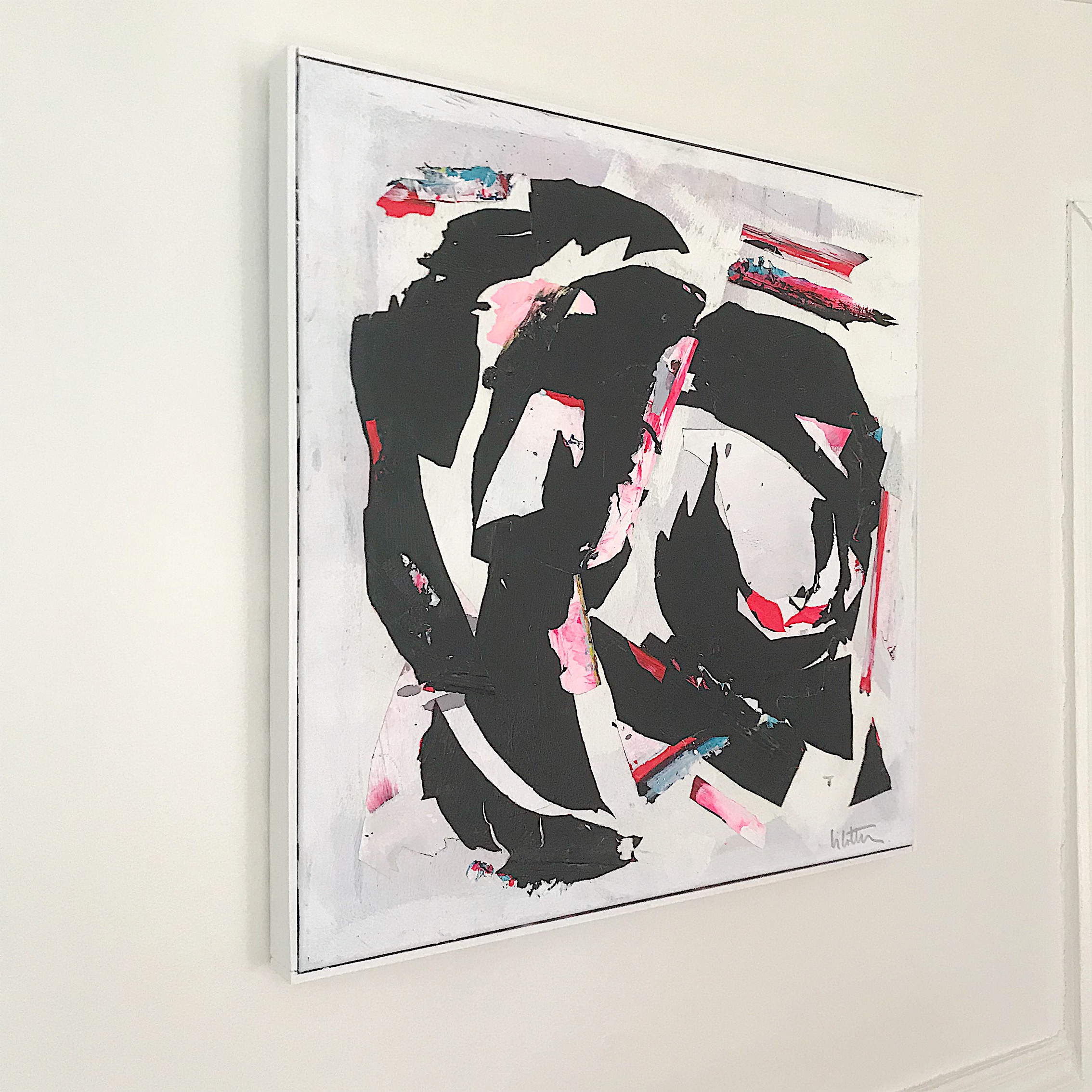
The artwork is by an artist we fell in love with the second our eyes met her work (and her studio 😍!). Linda Colletta was introduced to us through a dear friend that has a sweet interior design business locally (she will travel!) - Sarah Little Designs. After sharing our space and inspiration with Sarah, she thought of Linda for our room. She took me to her studio in Bridgeport, CT (it seriously inspired the pants off of me!) and my mind was filled with ideas and inspo for our space! Linda’s work is that of an an “abstract expressionist, creating colorful and uplifting works for designers and individual collectors.” The pieces we chose all have their own meaning and expression. The 3 on the one wall in a group all complimented one another so perfectly. The series really tied our surrounding rooms together so neatly (bringing in the teals and pinks and greys), while offering a funky form of expression to the space we hope to share with loved ones for many years to come. The lone ranger was a favorite of mine when I first stepped into Linda’s studio, so we figured out a way to incorporate it here.
Mike made the white floating frames that are around Linda’s pieces. We are so happy with them - and they took him no-time to build!
